Design Glossaries
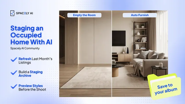
Staging an Occupied Home With AI
Staging a lived-in home is harder than staging a vacant one. Here's how to stage an occupied home with AI; declutter and restyle the photos, and keep it honest.…
Paphada Vasinsittisuk4 min read
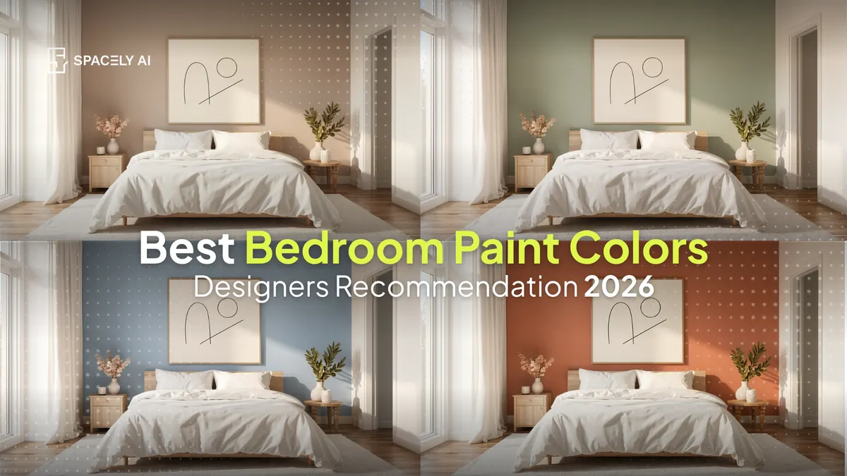
The bedroom paint colors designers reach for muted sage, warm greige, terracotta, and mineral blue; and why soft, muted tones feel most restful. See them on your wall.
The bedroom paint colors designers reach for most share one quality: they're muted. Soft, desaturated tones such as sage green, warm greige, mushroom taupe, terracotta, and mineral blue-gray; suit a bedroom because they feel calm and enveloping, while bright, saturated colors tend to read as more stimulating.
Green leads the way right now, especially soft, grayish greens that feel natural and restful without being loud. For a more intimate, cocooning room, designers lean on deeper tones like navy and charcoal. The principle underneath all of it is simple: choose the soft version of a color, not the vivid one. The tricky part is that a shade looks different on your wall, in your light, than it does on a small paint chip, so before committing, it's worth seeing the color on your actual wall, which you can do by uploading a photo to Spacely AI and testing shades with Point & Edit.
Below: the colors worth considering, why each works in a bedroom, and how to pick the right one for your room.
Match the color to your room's light and the feeling you want.
| Color | Why it works in a bedroom | Best for |
|---|---|---|
| Muted sage green | Calming and natural; softens beside wood tones | Most bedrooms, including cooler north-facing rooms |
| Warm greige / mushroom taupe | Quiet, elevated warmth without going stark | Neutral lovers and calm, minimal rooms |
| Terracotta / clay | Grounded, earthy warmth | Rooms with good natural light |
| Mineral blue-gray | Desaturated and restful, unlike icy blue | Serene, spa-like bedrooms |
| Deep navy / charcoal / moss | Enveloping and intimate | Rooms you want to feel cocooning |
| Creamy soft white | Warm and airy rather than clinical | Small or low-light bedrooms |
A helpful guide is the 60-30-10 rule: your main color on about 60% of the room (usually the walls), a secondary tone on 30% (furniture and textiles), and an accent on the final 10% (pillows, art).
Because a bedroom is for winding down, and soft tones lower the visual noise.
A dusty sage, a barely-there blue-gray, a soft warm white, or a deep enveloping navy all help a room feel restful. The vivid, saturated versions of those same colors tend to energize a space instead of calming it, which is why the most-loved bedroom palettes lean desaturated and earthy.
If you love a color but worry it's too strong, reach for the muted version of it — and test it on your wall first so you can see how it actually feels in your room's light before buying the paint.
Start with your light, then see it in place.
Since a chip can't show you a full wall in your own light, the most reliable step is to preview the color on a photo of your actual bedroom. Test two or three, set them side by side, and the right one usually makes itself obvious.
What is the best paint color for a bedroom?
Muted sage and soft grayish greens are a reliable first choice; they feel calming and natural and pair easily with wood and textiles. Warm greige, mushroom taupe, terracotta, and mineral blue-gray round out the most bedroom-friendly palette, all in soft, restful tones rather than vivid ones.
What paint colors help a bedroom feel restful?
Muted, desaturated colors. Soft versions of green, blue, and warm neutrals help a room feel calm, while bright, saturated colors tend to feel stimulating. A dusty sage, a soft blue-gray, a warm white, or a deep navy all work well for a restful bedroom.
How do I see a paint color in my own bedroom before buying?
Upload a photo of your bedroom to Spacely AI and test colors on the wall with Point & Edit or Auto Edit. It shows the shade on your actual wall in your room's light, so you can compare a few options and commit once.
More design insights on the Spacely AI blog →
→ Watch the full tutorial on YouTube
For more information and media inquiries, please contact
Website: spacely.ai
Facebook: facebook.com/spacelyai
Instagram: instagram.com/spacely.ai
Email: [email protected]
Staging a lived-in home is harder than staging a vacant one. Here's how to stage an occupied home with AI; declutter and restyle the photos, and keep it honest.…

How should a design agency set up its AI workflow? A practical guide to where AI fits, who owns what, the standards to set, and how to run it from brief to deli…
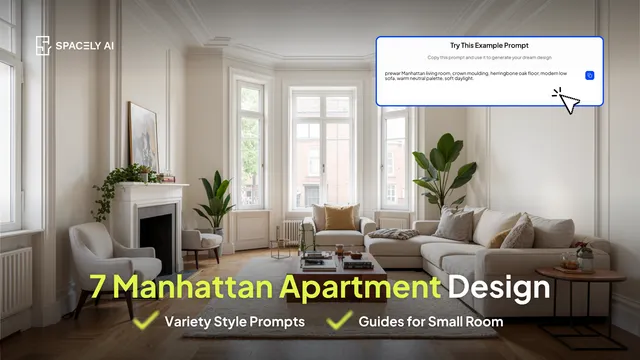
Manhattan apartment design ideas that work in real NYC spaces: small-footprint layouts, prewar charm, light, and quiet-luxury palettes, each you can test on you…